The best high converting landing page examples have one thing in common: every section moves the visitor toward one action. They do not try to say everything. Instead, they remove doubt, show the value, and make the next step easy. That focus is also what makes a landing page profitable, because every extra conversion comes from traffic you already paid for.
Ready to choose?Tech & Education website templates — every template with its live demo, formats and prices on one page.
Below are 10 examples of high converting landing pages, grouped by the type of return they bring. For each one, you will see the idea behind it and the sections that do the work. Each example is a real one-page HTML5 template you can open and test.
What Makes a Landing Page High Converting?
A landing page converts well when it answers the visitor’s questions in the order they ask them. In practice, that means:
- A clear promise in the headline that matches the ad or link.
- An interactive answer to the first question, such as a price, an estimate or available times.
- Proof near the call to action: reviews, numbers or photos of real work.
- Low effort to act: a short form, a builder, or a single button.
- Urgency that is honest, like seats left or a real end date.
How Landing Pages Improve ROI
Return on investment is what you earn from a campaign minus what it costs, divided by the cost. A landing page improves that return in two ways. First, it raises the share of visitors who convert. Second, it raises the value of each conversion, for example through a subscription or a larger order.
Here is a simple illustration with made-up numbers. If 1,000 visitors arrive and 2% convert, you get 20 customers. If a better page converts 3%, the same traffic brings 30 customers. So you gain ten customers without spending more on traffic.
10 High Converting Landing Page Examples
1. The Live Estimate: Approva
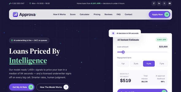
Approva, an AI lending landing page, answers the borrower’s first question before asking for anything. A three-question mini application returns a live estimate with an approval likelihood. Then, the transparent scoring section explains the result. Because the visitor already sees a number, the form that follows feels like the natural next step.
2. The Builder That Leads to a Booking: Caratelle
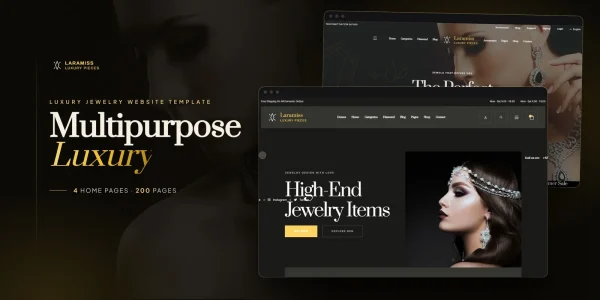
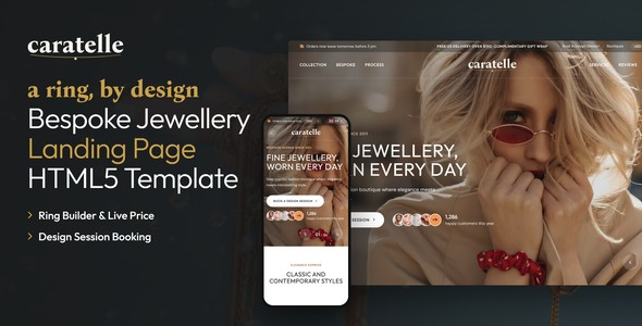
Caratelle lets a jewellery client build a ring and see the price line by line. After that, the design is handed to a five-step appointment wizard. The builder creates commitment, so booking the session is easy.
3. The Visible Scarcity: Aartiva
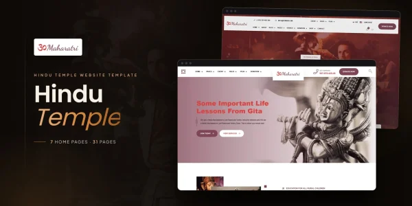
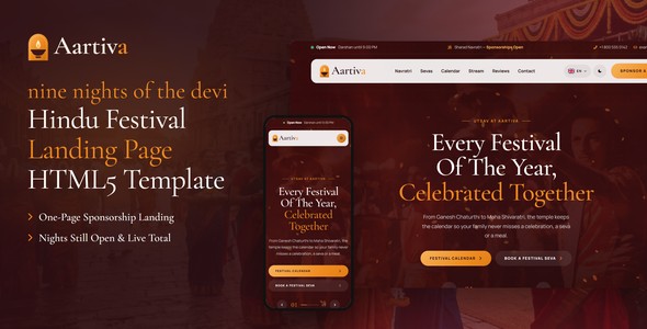
Aartiva is a festival sponsorship page for Hindu temples. Its sponsorship tiers show how many nights are still open, and the total updates as you choose. As a result, the urgency is real and visible, not invented.
4. The Subscription Builder: Crateful
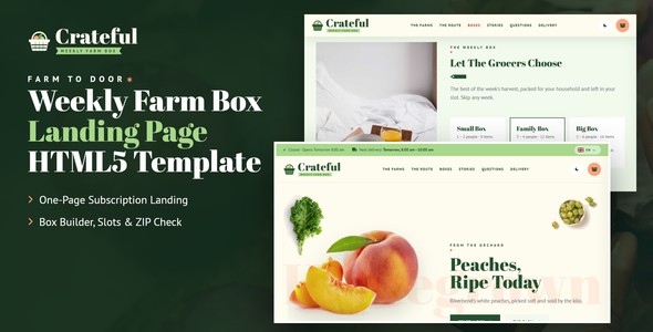
Crateful sells a weekly farm box. Visitors build their box first, and then they choose the delivery rhythm. A subscription multiplies the value of each conversion, which is why it lifts ROI so much.
5. The Instant Quote: Shiftly
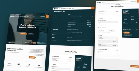
Shiftly prices a home move on the page. Movers’ customers want a number before they call, so a quote landing page filters out people who were only browsing. In turn, your team spends its time on serious jobs.
6. The Order-Ahead Menu: Cupello
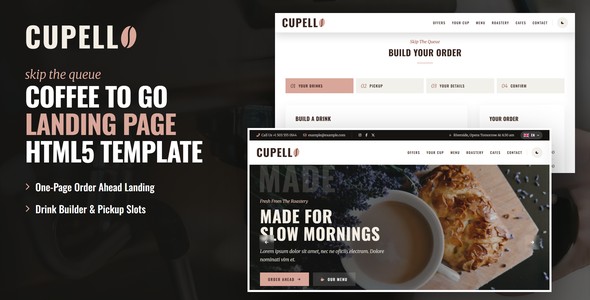
Cupello lets coffee customers order ahead and collect at the bar. It shortens queues at peak times, and customers who browse the full menu often add a pastry. Therefore, it raises both orders and order value.
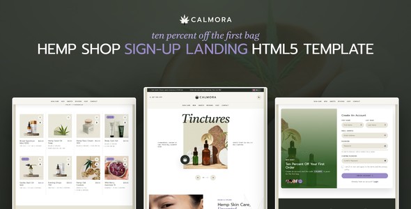
7. The One-Field Squeeze Page: Calmora
Calmora asks for one thing, an email address, and gives ten percent off the first order in return. A squeeze page converts well because it asks so little. Later, the email list turns those sign-ups into repeat sales.
8. The Trust-First Donation Page: Sadaqora
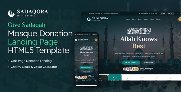
Sadaqora shows where each gift goes before it asks for one. Preset amounts and a monthly option make giving quick, while a recurring gift brings steady support.
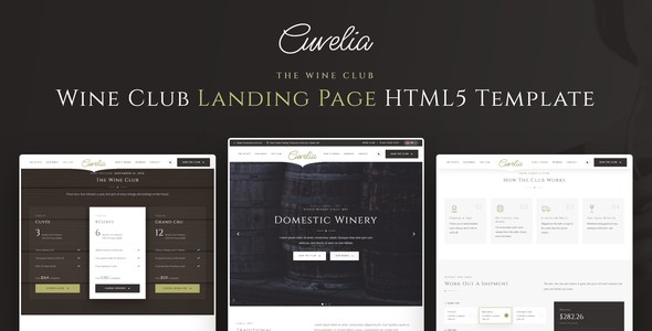
9. The Membership Tiers: Cuvelia
Cuvelia presents wine club tiers side by side, with what each tier includes. Members come back, so the lifetime value of each sign-up is much higher than a single purchase.
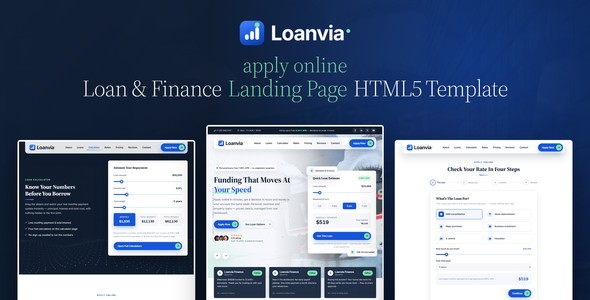
10. The Step-by-Step Application: Loanvia
Loanvia splits a loan application into short steps. Long forms scare people off, whereas short steps feel manageable. Consequently, more applicants finish.
Patterns Behind High Converting Landing Pages
Look across the examples, and the same patterns appear:
- Give before you ask. An estimate, a price or a builder comes before the form.
- Make the value bigger than one sale. Subscriptions, memberships and recurring gifts multiply ROI.
- Use real urgency. Seats left, nights open or a real end date work; fake timers hurt trust.
- Cut the effort. One field, short steps, or a single button.
- Keep one goal. Every example has one call to action, repeated down the page.
The Anatomy of a High Converting Landing Page
Most of the examples above follow the same order of sections. That order mirrors the questions a visitor asks, one after another:
- Hero: what is this, and is it for me? A specific headline and one button.
- The interactive answer: what will it cost me, or what will I get? An estimate, a builder or open times.
- Proof: can I trust them? Reviews, numbers and photos of real work.
- Details: what exactly is included? Plans, sizes, menus or steps.
- Objections: what if something goes wrong? An FAQ, the terms and a person to ask.
- The action: the form or the checkout, with the call to action one last time.
So if your page skips a question, visitors look for the answer elsewhere. Then they rarely come back.
Headline Formulas That Convert
The headline decides whether visitors read on. Here are four simple formulas, with examples by type of landing page:
| Formula | Example |
|---|---|
| Outcome + time | Your loan estimate in sixty seconds |
| Action + what makes it easy | Book your table, see the times that are free |
| Product + who it is for | A weekly farm box for busy families |
| Cause + what one gift does | One gift feeds a family for a week |
In each case, the headline names a result the visitor wants. It does not describe the company.
Calls to Action That Convert
A good call to action says what happens next, in the visitor’s words. For example:
- “Get my estimate” instead of “Submit”.
- “Book a table” instead of “Learn more”.
- “Start my box” instead of “Sign up”.
- “Give monthly” instead of “Donate now”.
Also, use the same wording every time the button appears, so visitors always know where it leads.
A Worked ROI Example
Here is how the numbers change when a landing page improves, using illustrative figures for a campaign that costs $500 and brings 1,000 visitors:
| Before | After | |
|---|---|---|
| Visitors | 1,000 | 1,000 |
| Conversion rate | 2% | 3% |
| Customers | 20 | 30 |
| Value per customer | $40 | $40 |
| Revenue | $800 | $1,200 |
| Return on $500 | 60% | 140% |
The traffic and its cost did not change. Only the landing page did, and the return more than doubled. That is why improving the page often pays more than buying more traffic.
Why Landing Pages Fail to Convert
- Too many goals: visitors cannot tell what to do first.
- A vague headline: it describes the company instead of the result.
- No price or no estimate: visitors leave to find one elsewhere.
- A long form too early: people are asked to commit before they see value.
- A slow page: visitors give up before the page loads.
- No proof: nothing shows that other people trusted you first.
How to Measure the ROI of a Landing Page
To measure ROI, track three numbers for each landing page: what you spent to bring visitors, how many converted, and what those conversions were worth. Then compare pages and channels by return, not by visits. Tools such as Google Analytics 4 can record each form submission or purchase as a key event.
Frequently Asked Questions
Explore more examples: browse all one-page HTML5 landing pages and open any live demo.